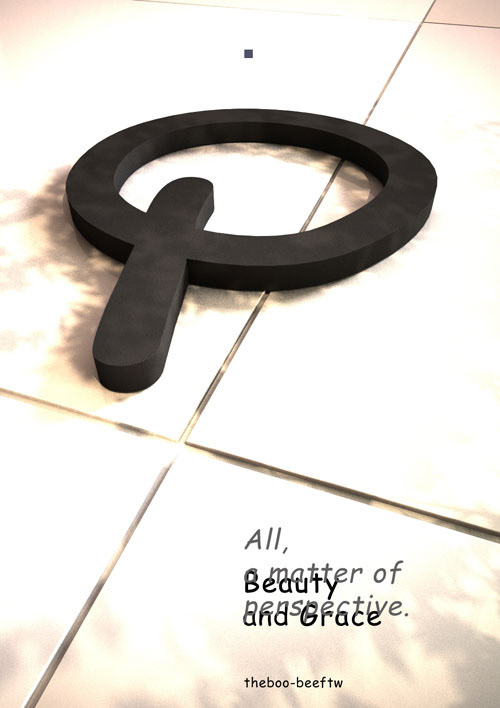
Challenge: Make a poster using the Comic Sans typeface and make it look good, in less than 1 h.
Comic Sans is the black sheep of the typography flock (not the only one, mind you) and its poor aesthetics make it a "formidable" tool when trying to craft a design using it. That was the starting point: can this typeface be used in a poster and give meaning to the message contained therein while the result is also aesthetic in itself?
The works below are the first part of this challenge as we inted to both revisit it and invite other graphic designers or studios to participate. We will be tackling other typefaces and issues in upcomming challenges.
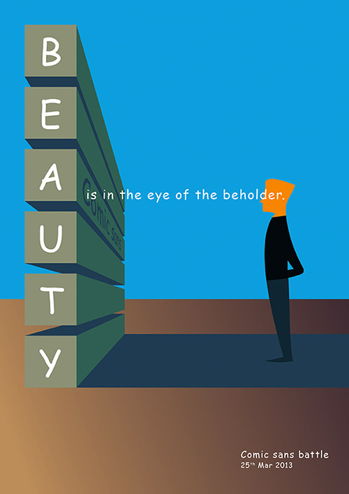
Kraftmark Comic Sans Challenge - Valentin Popescu.
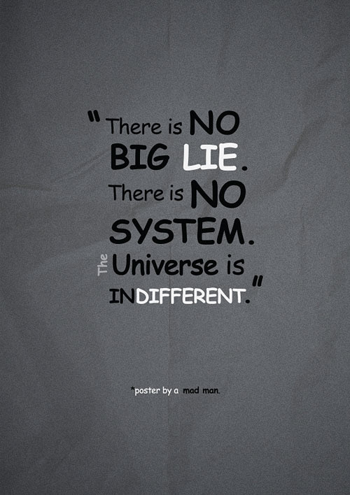
Kraftmark Comic Sans Challenge - Alex Balaita.
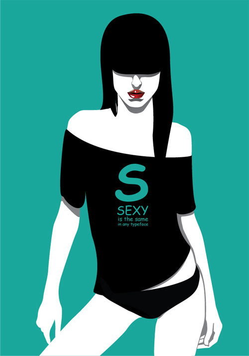
Kraftmark Comic Sans Challenge - Cristina Stefan.

Kraftmark Comic Sans Challenge - Mihai Velcescu.
Kraftmark Comic Sans Challenge - Vlad Osiac.